
You know a modern website when you see it. They’re trendy, yet sophisticated, and professional. Above all, effective modern website designs have adapted to suit current users’ needs and expectations.
When your website has to compete against the 1.88 billion others online, you need to deliver a website with excellent user experience and a modern design that catches their eye. Modern websites are a complete opposite from the clunkiness of 2000s websites. They’re sleek, trendy, professional, and highly practical.
In this article, we’ll dive into the 10 elements that are a must when it comes to modern website design. You’ll also find some industry examples to help get you started.
If you’re new to website development, we recommend checking out our other blog as a guide.
White space is often a go-to element in minimalist web design, but it’s become the standard feature for effective modern websites now.
It’s the area between design elements that helps you keep your website clean and organized.
You’ll often see uses of white space to distinguish the visual elements of a page–such as images, graphic icons, call-to-action buttons, and written content–helps direct users to certain parts of your site. White space is a common practice used as a tool by web designers to design for the user experience.
Contrary to popular misconceptions, white space is not necessarily white nor does it mean emptiness. It can be created using any color, texture, patterns, or even a background image to help create space between your content.
In essence, white space promotes simplicity in the overall design. By using white space, brands can emphasize the importance of certain messaging or other visual elements to the center stage, resulting in a modern look.
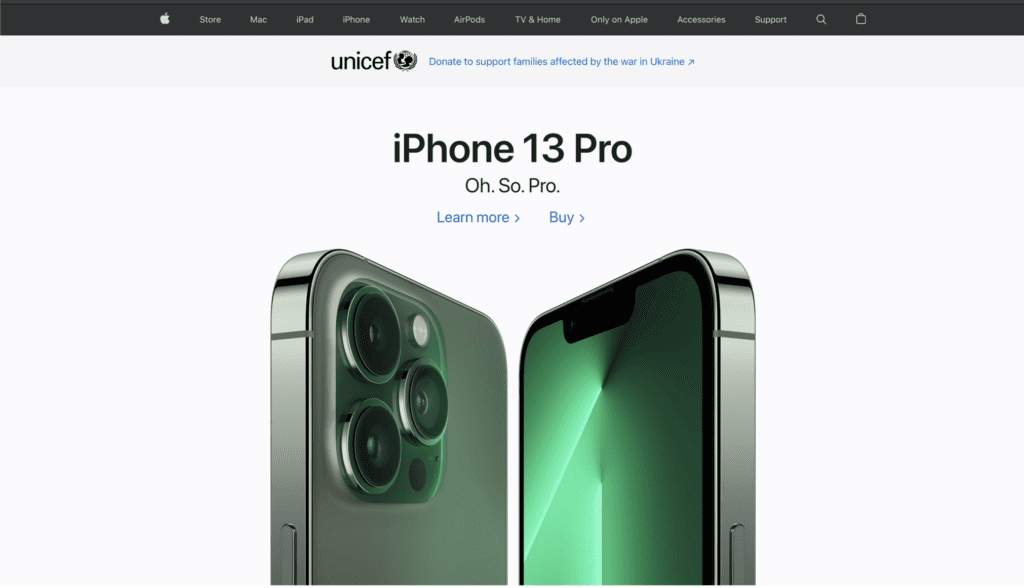
Apple really has a way of utilizing white space to garner attention to drive sales. Their products are laid out in an art showcase style, which rids any possible distractions around their website.
Nowadays, websites have way more flair and dynamism than their predecessors. If you’re looking to make your website look more “alive”, adding dynamic scroll effects will do just the trick. Plus, adding these will add more interactive functions to make your user’s experience more interesting.
Creating movements and a seamless flow using fun elements like parallax scrolling is a surefire way to encourage your visitors to explore more parts of your website.
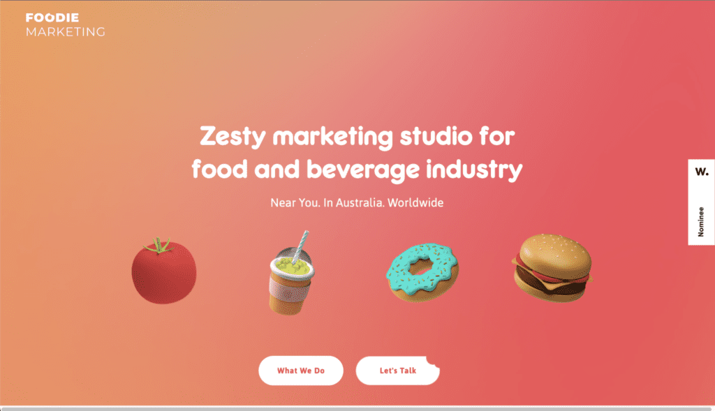
Since 2021 was the year we saw more bold and pastel color palettes in web design, it’s still true for website design in 2022. Bold, bright, and colorful elements are powerful must haves when it comes to website design.
Of course, these color schemes have to match your brand colors and tone. It’s important to note that there’s a lot of study behind color theory and how certain colors have a way of provoking specific emotions.
For example, warm colors like red, orange, and yellow are typically associated with being energizing, passionate, and positive. On the other hand, cool colors like green, blue, and purple are usually more calming and relaxing.
Modern website design is all about standing out with eye-catching designs. So don’t be shy with experimenting with your color schemes!
Bold colors may be the first thing that catches your website visitors’ attention, but unique typography can help as well. Depending on the lettering or font style you choose, you can easily set the tone to welcome them to your modern website. Businesses can more accurately express their brands through the wider selection of fonts available today.
Typography can be used in all sorts of sizes. Contrary to the best practices used in the early 2000s, web designers nowadays have leveraged large statement typographies for their websites. Some web designers use it to cover the entire top section of a webpage with a single word or phrase. This approach makes the text the initial focus whilst providing context for first time visitors.
Moreover, the kind of typography you choose can give viewers hints about what your brand represents. Is your brand fun or serious? Artistic or informative? Whatever qualities it possesses, be sure that your designers consider its application across all browsers and devices. You really don’t want your beautiful website to look clunky or come off awkward on different devices.
It’s no longer news that half of the worldwide web traffic comes from mobile devices. So if you’re creating a desktop-only site, it’s time to step up your (website) game. If not, you could be losing up to half of all prospective customers.
The key to a modern site is to keep your user’s experience consistent across all device types. If you’re building a website with a website builder like Elementor or Wix, you can easily optimize your website for mobile and tablet views.
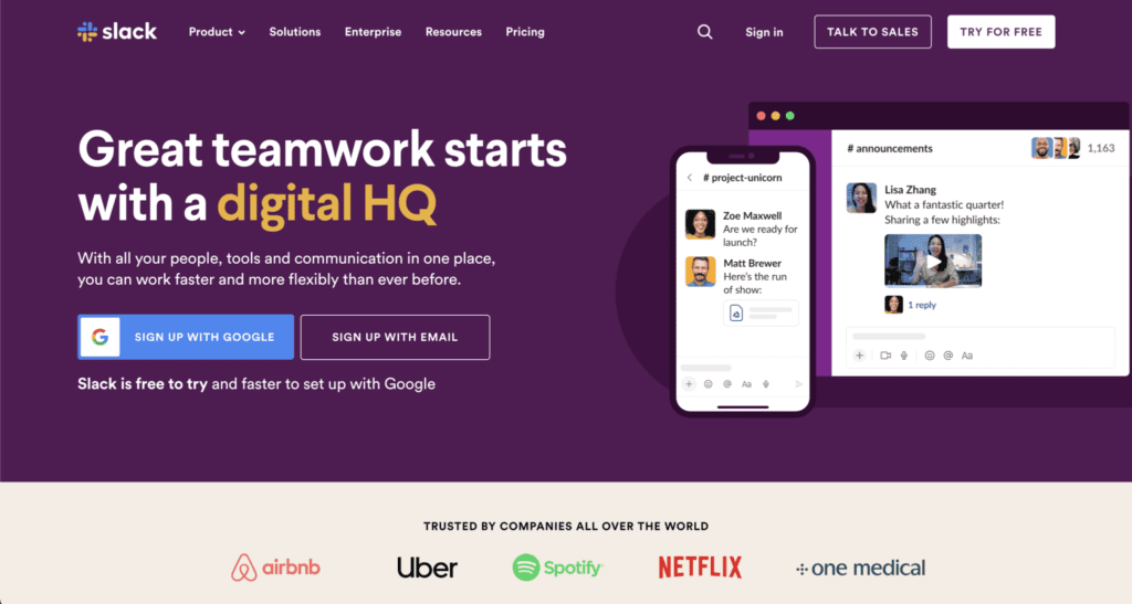
It’s a fact that our attention spans are shorter than a goldfish’s. That’s why many content creators and web designers are constantly keeping things engaging and interactive.
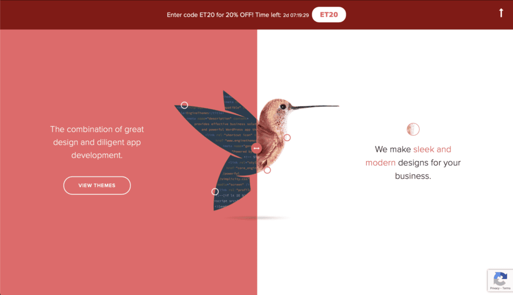
In website design, there’s this practice of adding movement called animation web design. This means that adding these interactive, dynamic elements to your site can engage visitors when they click, scroll, or hover on your site. It’s undoubtedly attention-grabbing, since our eyes tend to seek movement and focus on moving objects rather than static ones.
Motion also adds a tinge of playfulness that invites your website visitors to be part of the website experience. There are a couple of ways to add animation into your web design:
Website navigation plays a critical role in user experience and ultimately, user satisfaction. This includes all the buttons, menus, and links on your website that lead visitors to the other pages depending on how easily visitors can find them.
Clear navigation is vital because it ensures that your website visitors can find the information or the pages they’re looking for. Otherwise, they’re far less likely to click through and be converted into qualified leads. Poor user navigation can also badly affect your bounce rates which leads to poor overall search performance too.
When you want to design an intuitive and modern website, you should consider streamlining the process of how your visitors get from point A to B on your site.
You’ve heard the saying that ‘less is more’. When it comes to modern website design, there is beauty in minimalism. Although some may argue that choosing a minimalistic design seems like a safer design route, however, these designs are beneficial when it comes to looking professional.
A minimalist web design will only have the most relevant elements to maintain a clean website to prioritize easy navigation for the users. The lack of clutter with the right choice of design schemes can make any website look minimalistic yet modern.
An important aspect of modern website design is crafting a cohesive visual experience for your visitors, and one way to do that is with a clean website layout. You might’ve seen some web designs that are asymmetrical and others the classic symmetrical layout.
It’s modular in nature but the grid layout gives designers the freedom to choose between having it in a symmetrical or asymmetrical style, minimal or full of details.
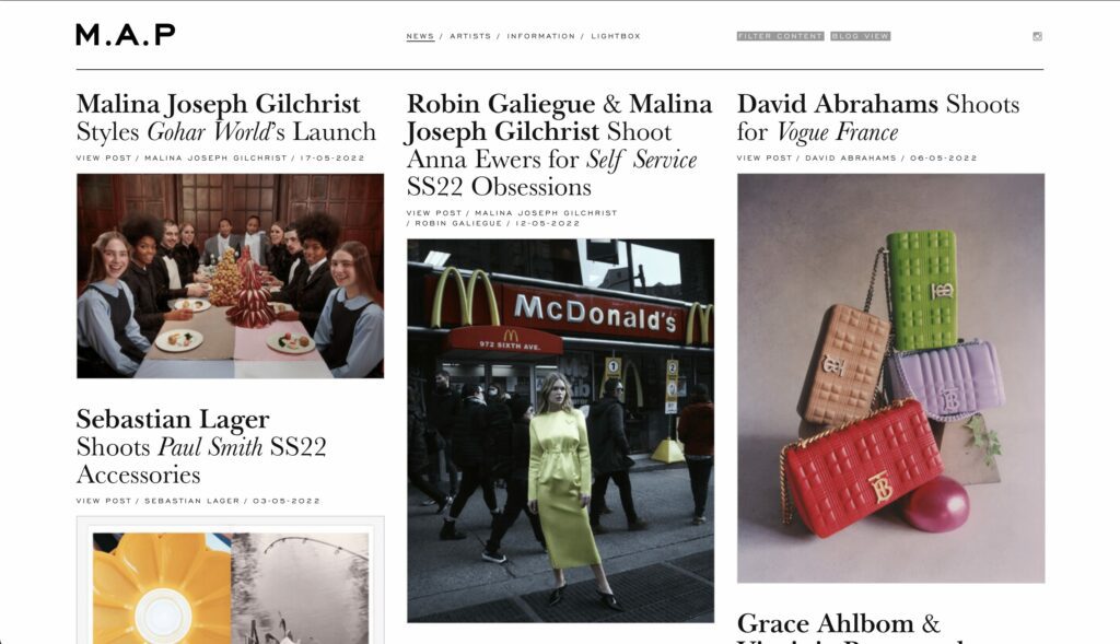
This layout is a popular way to offer dramatic visuals that pop, demonstrate contrast between multiple options, or even used to efficiently navigate users.
Last but not least, strongly consider incorporating videos onto your landing or home page.
Videos boost organic search traffic to your website by 157% and your website is 53X more likely to rank on the first page in search results if it includes video. It’s no secret that videos are the most effective way to engage your audience. We process videos faster than we do with text!
They’re also a powerful visual storytelling tool which can complement your brand messaging and identity. When you include a homepage video, it gives your audience a snippet of who you are and the message you want them to receive from the first visit.
If you’re revamping your website, placing a video on your homepage’s top fold–the content your website visitors sees before they scroll down–should immediately pull your audience in.
These are the core components to consider but it’s all part of the fun of designing a modern website design! Whether you’re starting a business, re-branding, or simply planning to freshen up your website, having a modern website will definitely reap you benefits.
If you’re looking to explore ways to update your website design to fit current design trends, get in touch with us! You can write to us at hello@medianetic.me, or drop us a message via our chatbot below! We look forward to working alongside you.

Medianetic Sdn Bhd
200301016995 (619415-K)
No. 59, 2nd Floor, Block E, Zenith Corporate Park, Jalan SS7/26 Kelana Jaya, 47301 Petaling Jaya, Selangor
hello@medianetic.me
+603 7960 3088 (Office)
Medianetic Sdn Bhd © 2023
Made by Medianetic