
Design plays an essential role in ensuring that marketing campaigns are successful.
With brands becoming more competitive and customer behavior evolving, you’ll need to find ways to stay ahead of the curve. What better way to do so by curating out-of-the-box designs? From conception and colors to font and hierarchy, remember that the design you choose will either make or break your campaign.
In this blog post, we share 11 design tips that will help take your campaigns to the next level.
Visual design plays a vital part in marketing for many reasons. For one, your visual design is your audience’s first impression of your product/service/solution. Studies have discovered that we have 50 milliseconds to make a good impression before users make their first judgment.
By making a great initial impression, you’ll increase your credibility and your audience’s trust in your brand. Consumer Reports states that users will decide whether a site is credible through visual cues, rather than actual content. This may sound daunting, but it can be very beneficial and advantageous for your brand, if done right.
Having a beautiful design campaign will not only set you apart, but also provides the tone of your campaign’s purpose. While it’s good practice to keep your overall brand identity intact, it doesn’t mean that you’ll have to lock your creative in a box forever. You can still introduce some new, creative elements to your campaigns without compromising your brand’s guidelines.
Investing time and effort into visual design can only serve to strengthen your campaign and propel it forward.
If you’re the type of creative to jump straight into the creating stage, I’d hold off until you fully understand the goals and purpose behind your campaign.
This word of the wise is not to deter your creativity, but to help proactively point it in the right direction.
The best rules of thumb to follow is:
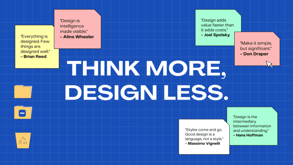
Ellen Lupton advises designers to: “Think more, design less.” Through adopting this mindset, you’ll save yourself valuable time, effort, and costs.
After you’ve established your overall strategy, you’ll be ready to move on to the next stage of the design process.
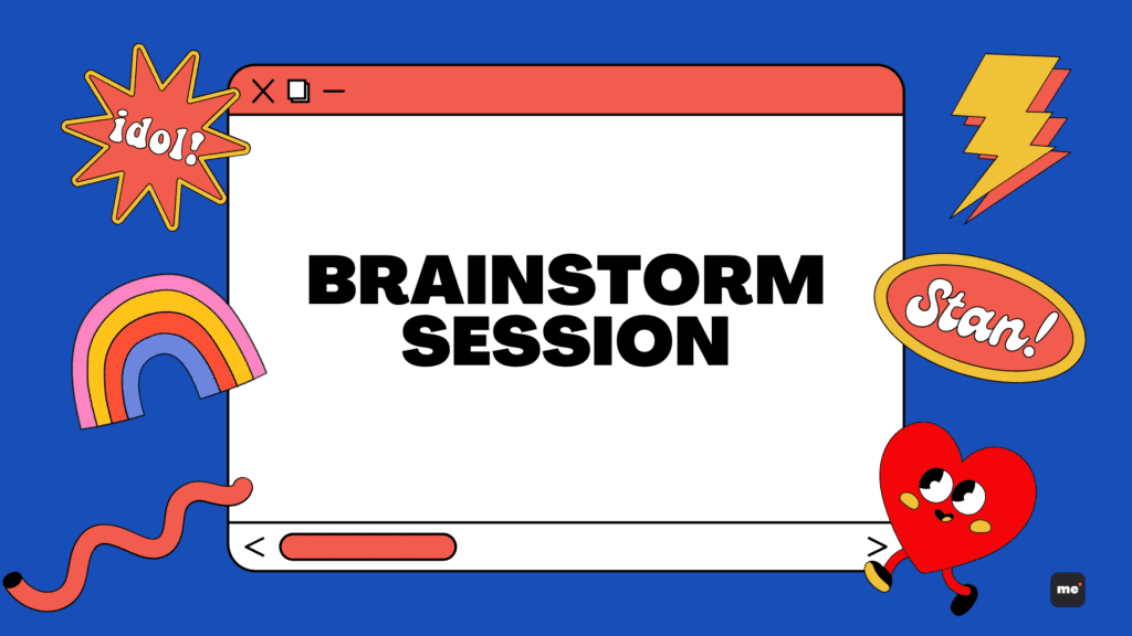
Nothing is more valuable than having a productive brainstorming session. This method of design thinking is extremely popular for marketing and design teams because it allows you to think of wild ideas. With the help of these sessions, you’ll be able to deploy lateral thinking to seek out the most effective solutions for creative problem solving. By building, considering, and harvesting your team members’ ideas, you’ll be able to cover more angles. Like Alex Osborn once said, “It is easier to tone down a wild idea than to think up a new one.”
Here are a couple of tips to help make your brainstorming sessions conducive:
Out-of-box thinking is what our Creative Lead emphasizes. As a result, we always advise others to be bold in going against the norm or trend. By allowing yourself to have the space to be inventive, you can envision fresh concepts.
Out-of-the-box thinking is synonymous with design thinking, so be adventurous and experiment!

Moodboards are exceptional methods to employ when it comes to nailing down your concept.
By creating a visual moodboard, you can consolidate all your creative ideas together in a singular place in order to gain a macroview of what themes, styles, fonts, colors, etc. work well together.
The best way you can ensure that your designs have variation is by finding 2-3 different styles, and then finding a way to combine them to create something new. For example, you can have one style focus on art deco, while the other two are more centered around being minimalist or retro. This empowers you to find new avenues of design styles. TL;DR—Don’t be afraid to throw out your wildest ideas and see what sticks.
Here are a few apps we use for moodboarding:
Visual hierarchy focuses on arranging elements to show your content’s order of importance. Designers strategically structure visual characteristics to help users digest information easily as a means of persuasion and influence.
An important principle of thought to note is:
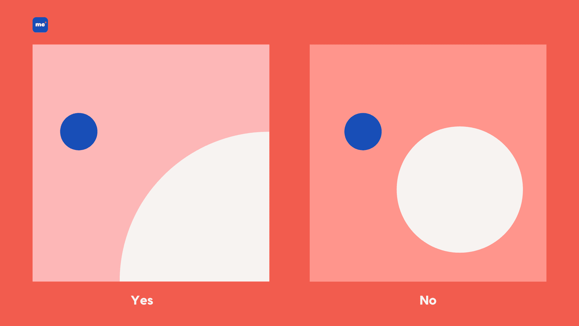
Eye flow is what it sounds like. This method determines how the eye is led through a design—where it looks first, where it will look next, where it will pause, and how long it will stay.
Having your design integrate this principle will help tell the story of your campaign by presenting your information in all the right places. This is vital for storytelling.
Source: Medium
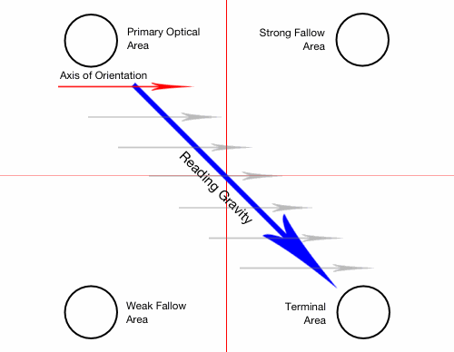
Patterns of visual information processing play an immense role in eye flow. There are two ways we process visual data—through F or Z patterns.
The F patterns are the most common approach for text-heavy designs. The style of the pattern is what it sounds like—it follows the shape of the ‘F’, which starts at the top left and moves horizontally across to the top right. Viewers will follow down the left-hand side of the page for information before shifting to the right.
The Z patterns are for less dense designs. With this technique, readers will start at the top left, move horizontally across to the top right, and then cast their flow downward to complete the Z shape.
Depending on what your campaign needs, these techniques can only serve to improve your designs. But what other factors play a part in the ecosystem of your design’s success? That brings me to my next tip.
Source: Toptal
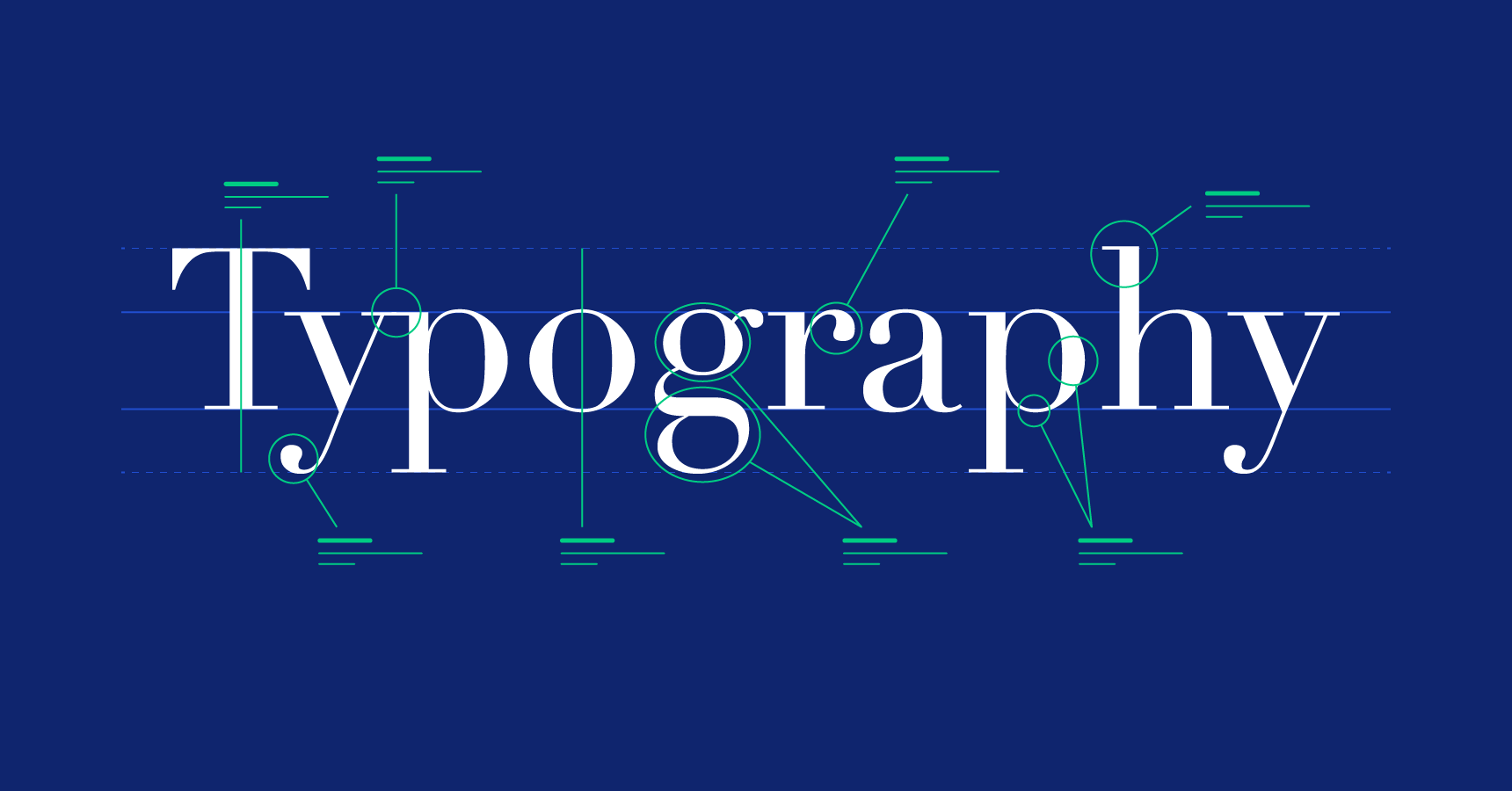
When choosing fonts, it is best to first put yourself in the minds of your target audience. In order to create a successful design, you’ll need to know what kinds of typefaces will appeal to them.
Being able to interpret the connotations behind different typefaces is an asset. For example, large, bold, full caps sans-serif typefaces are highly visible, but they are more dramatic in nature. This may increase the significance of certain words within your design.
If you choose to use display fonts, you can either utilize them for headlines or decoration. For example, using large display fonts will catch your viewers’ attention first. This is one of the easiest and most effectives to give certain phrases visual importance. However, these use cases are dependent on your campaign’s theme, brand, and overall messaging.
Other important factors to consider:
As with any design principle, balance and moderation are key. You’ll need to find the right harmony between your typefaces.
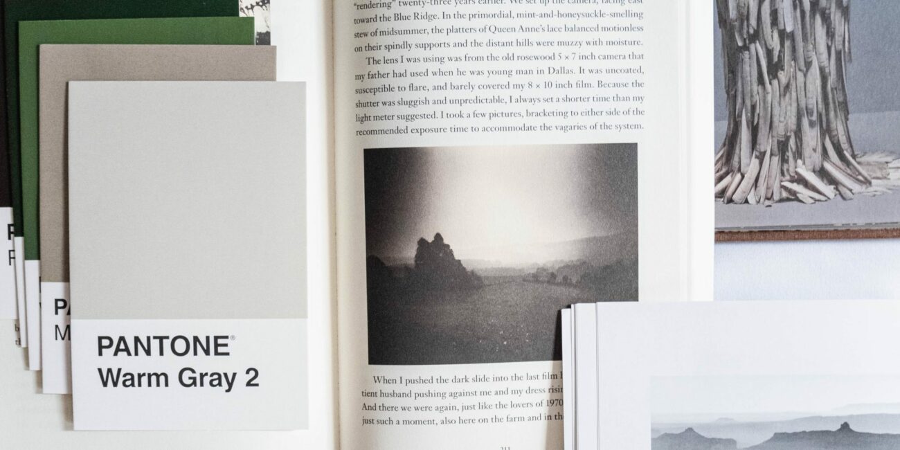
As visual beings, we’re naturally drawn to color—especially when they’re used strategically to highlight important information. Utilizing the right color for your design can help portray your campaign message clearly and succinctly.
When choosing colors, please remember to use certain colors sparingly and to find the right proportion. If your business is focused on lifestyle products/services, you generally want to find colors that make your brand more warm, open, and friendly. Picking the right color temperature is key. We suggest looking for earthy tones like yellow, green, blue, and brown to provide the right color and contrast to grab your viewer’s gaze.
The next factor you’ll need to consider is your color’s value. Color value is defined by the lightness or darkness of it. Like temperatures, colors of different values can be a great asset when it comes to contrast.
After you’ve sorted out the value, you’ll have to consider its saturation. Color, when in its purest form, is at 100% saturation. The closer it is to gray, the more desaturated it is. Leveraging bright or muted colors can be a strategic way for you to create contrast in your design as well.
If you’re nerdy like me, you can learn more about the psychology behind color here.
Source: Canva
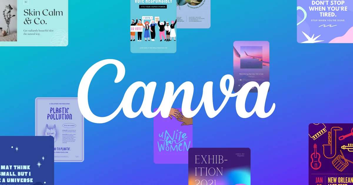
Design apps like Canva and Over are perfect for easy and beautiful designs. They’re also ideal for marketers on a tighter budget.
Canva or Over can help you elevate your designs from the extensive graphic and element library. From there, you can create variations of fonts, color combinations, elements, and more. This allows you to have more dynamic designs—ones that you don’t need to spend hours creating.

Source: Canva
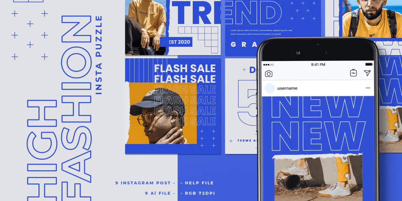
When in doubt (or on a time-crunch), use pre-designed templates! Canva and Over have thousands of varying templates available for your choosing. Once you find the template that best suits your moodboard, concept, and campaign message, you can easily customize it to add your own unique creativity.
This is arguably one of the most important tips you need to integrate into your entire design process. As your campaign starts taking shape, it’s always a good idea to preview your designs to see how it will look like on your socials and Google Ads.
Not only will this help you verify what may need to be changed, it will also give you a holistic view of how your campaign will look with your entire social feed and campaign.
Last, but not least, remember to ensure that your design fits with your overall branding. It’s completely alright if your design is using different colors, fonts, or design styles to showcase your campaign differently, but it has to stick within the overall parameters of your brand.
It will do you no good if your campaign’s designs are completely different from your brand. This only serves to confuse your target audience, since they won’t be able to tell if this campaign represents your business accurately.
In short, stay consistent but feel free to see how far you can amplify your creativity without compromising your branding guidelines.
My last piece of advice? Have fun and don’t be afraid to take creative risks! Try out new things to keep your audience engaged and on their toes.
If this guide has helped you, feel free to share your thoughts with us at hello@medianetic.me.
If you need help in leveling up your designs and content, we’d love to see how we can work together! Get in touch with us at hello@medianetic.me.

Medianetic Sdn Bhd
200301016995 (619415-K)
No. 59, 2nd Floor, Block E, Zenith Corporate Park, Jalan SS7/26 Kelana Jaya, 47301 Petaling Jaya, Selangor
hello@medianetic.me
+603 7960 3088 (Office)
Medianetic Sdn Bhd © 2023
Made by Medianetic